How to Create Custom Templates for Your Business
Are you sick of scrolling through Canva designs, trying to find the one that best fits your brand?
Do you feel absolutely drained when creating marketing graphics and collateral for your small business, like you’re reinventing the wheel every time you design?
Are you craving more visual consistency in your social media graphics, client communications, and other everyday marketing and promotional pieces?
What if I told you there’s something that helps with all of the above and makes designing marketing graphics and collateral so. much. easier and streamlined?
Welcome to the world of custom graphic templates!
Creating templates for your most commonly used graphics and designs is an absolute necessity when you’re running a small business. Yes, it does take some energy and planning. But friend, trust me when I say the time is SO well spent!
Let’s say GOODBYE to creating every graphic from scratch and constantly reinventing the wheel.
Let’s say SEE YA LATER to staring at Canva document spinning your wheels and constantly tweaking your designs.
And let’s say HELLO to creating intentional, quality, on-brand, and functional templates for your business that will help you move the needle forward in your marketing… perhaps in ways you may not expect.
Why is it important to create custom-branded templates for your business?
It’s not just about having pretty graphics. Using templates will help you:
1.) Naturally create more cohesiveness in your visual marketing…which leads to brand recognition
Have you ever seen an Instagram graphic, commercial, or billboard where you know what company it’s for at first glance? That’s brand recognition! And that’s what we’re after as small business owners. Using the same colors and fonts, and similar graphic layouts in your marketing designs will help you create a cohesive look in your marketing as a whole, which will naturally help you become memorable to your audience and will build brand recognition. Templates are a really great way to help you accomplish this because you’re giving yourself visual guidelines, which will result in you being more cohesive with your marketing visuals.
2.) Save you so much time + energy in the long run
If I've learned anything over the years as an entrepreneur, it’s that we have to protect our energy and make sure we're putting it toward things that matter. Creating templates does take time and planning. Reinventing the wheel for every graphic is not on that list. So create some templates and start getting your time back!
3.) Keep you organized and streamlines your marketing + design process
No more having a million different files for your different graphics and having them be all over the place, not knowing where to find them. Having go-to templates (and having a good organization system for them!) will help you streamline your design process and cut down on the time it takes to create your everyday designs.
Creating templates for your business may seem like a small thing, but if I’ve learned anything after all these years of running my small business, it’s that small intentional shifts and changes can create BIG results.
Have you ever heard of the 80/20 rule? This is such an important thing to remember in every aspect of business, including marketing:
THE PARETO PRINCIPLE
80% of your results come from 20% of your efforts.
Bottom line: You can make a big impact in your visual marketing by setting aside a little time to streamline your graphics.
I’m sharing a step-by-step guide for creating a set of templates that will speed up your design process AND help you create a consistent + cohesive vibe that builds brand recognition with your audience.
Let’s dig in!
A step-by-step guide to creating graphic templates for your business
SO YOU CAN SAVE TIME + BUILD BRAND RECOGNITION WITH YOUR AUDIENCE
STEP 1
Take inventory of your frequently used marketing graphics + collateral
Make a list of all your social media graphics, client communications, blog imagery, and beyond that you’ve created over the past 3 months — make sure you’re covering everything you’ve created and used daily, weekly, or even monthly. Then add any graphics or collateral that you’d like to create but haven’t gotten to yet!
Next, organize your list by grouping similar graphics/collateral together that are similar in nature and have (or could have) a similar design or layout (aka use the same template!).
From here, you should be able to look at your list and see how many templates you need to design.
STEP 2
Choose a design program to use.
Be realistic. What program will be most efficient for you to use and will give you the results you’re looking for? Use that one!
When you’re first starting out, I highly recommend Canva for most design projects and templates. If you’re looking for a more robust program and you’re willing to invest a little time into learning it (and you’re cool with a monthly subscription cost), Adobe InDesign is my go-to for most marketing collateral designs.
STEP 3
Make a plan for your template design.
Choose one template from Step 1 to start with and plan for the design.
Make a list of the elements and content (text, imagery, branding elements, etc.) you need to include in the template. Get specific! Then get clear on what parts of the design will need to be editable vs. what can remain static/consistent every time you use the template.
For example, if you’re designing an Instagram graphic template you may need headline text, a photo, and your website address at the bottom. You will need to swap out the text and the photo every time you use the template. The general layout can remain exactly the same and the website address won’t change.
Next, I recommend actually putting together content for a real design you need to create using the template. Working with real text and imagery (as opposed to placeholders) will be super helpful in determining how much space you need to leave for text and how photos and other elements will actually look. So skip the guessing game and just work with actual content! This way, you’ll have one graphic all set to go too :)
Want more tips on how to plan for your design? Check out this blog post!
STEP 4
Have your style guide handy
The key to a successful marketing design of any kind is having a solid brand style guide in place, including a color palette, font system, and defined logos and branded marks. This will help you create an on-brand look (both in these templates and beyond!) and ensure you’re creating visual consistency across all your marketing collateral and graphics.
STEP 5
Start designing!
Now it’s time to take the foundation you’ve set and planning you’ve done… and start designing!
Here are two rules I go by when I design templates for my branding clients. I encourage you to use these too!
Find balance of structure and flexibility.
You want your templates to provide you with structure so you’re not reinventing the wheel every time you sit down to use them and insert your content. A strong layout with good organization will help with this, so you know exactly where to insert content and the approximate length it should be. At the same time, you want there to be enough flexibility to accommodate slightly differing lengths of text, swapping out images and colors, etc. So do consider the varying content that will need to be incorporated when you use the template.Simple is best.
Simple = clear. Complicated template designs will be more difficult to use in your day-to-day (cutting into the time you’re hoping to save!) and can create confusion around your message… which will lead to your design having less impact and not connecting with your audience (which is the whole point!). So, try not to over-complicate your templates with all the bells and whistles. Keep them clean and straight forward, knowing you can make small adjustments as you need to on individual designs.
STEP 6
Use them consistently!
Now that you have your templates designed and ready to go, start using them consistently!
If you start to feel bored with your templates and get the itch to “switch it up,” remember… you’re thisclose to these designs and looking at them all the time. But your audience isn't! Consistent use of on-brand templates will help make your visual marketing look cohesive and professional, and gain brand recognition with your audience… which will lead to making a connection with them.
Let’s brainstorm!
Stuck on what marketing and communications pieces you could create templates for in your business? Here are some ideas for commonly requested templates from my clients!
Social media graphics
Presentation slides/deck
Blog post thumbnail graphic
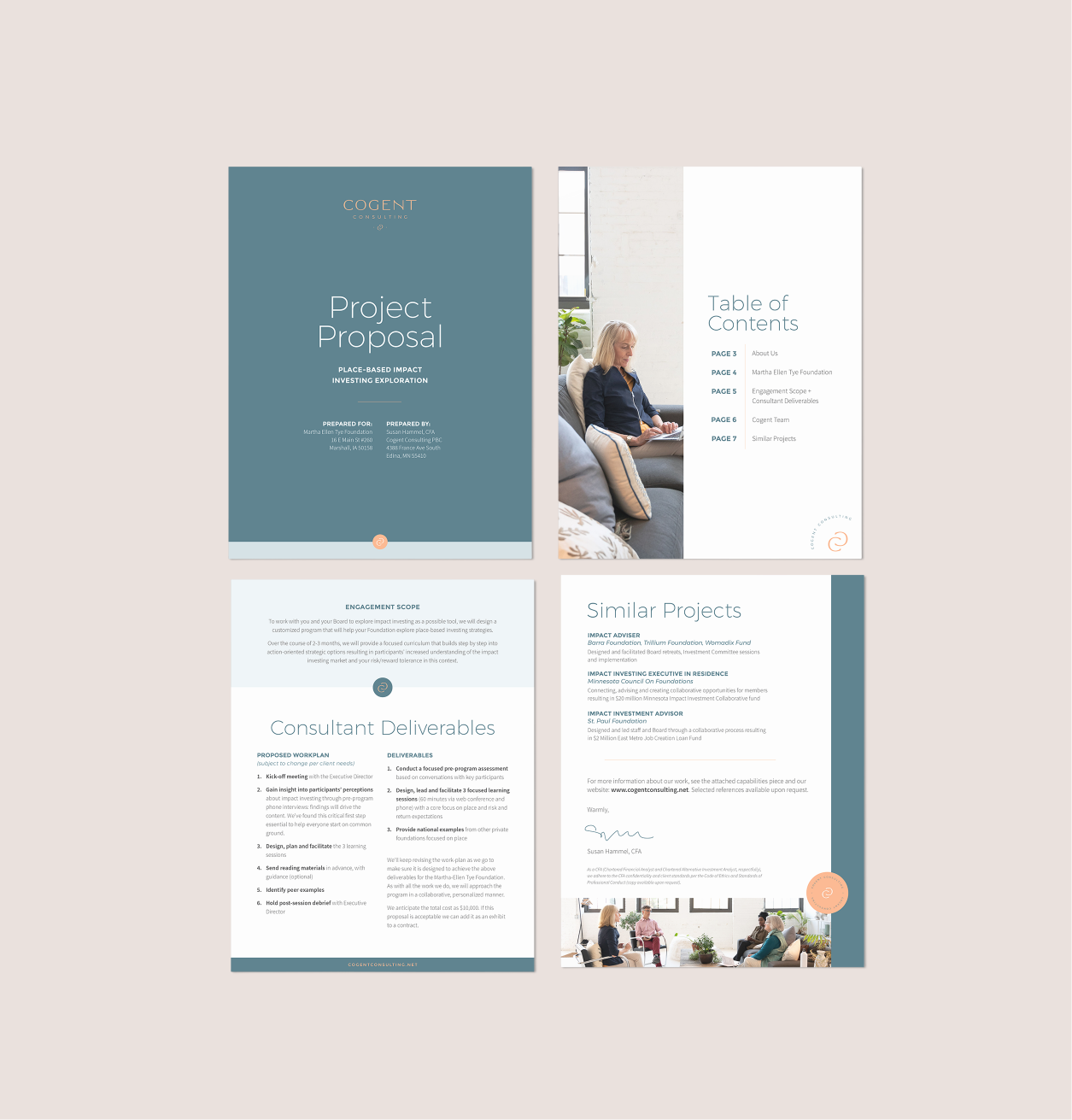
Project proposal
Employee business cards
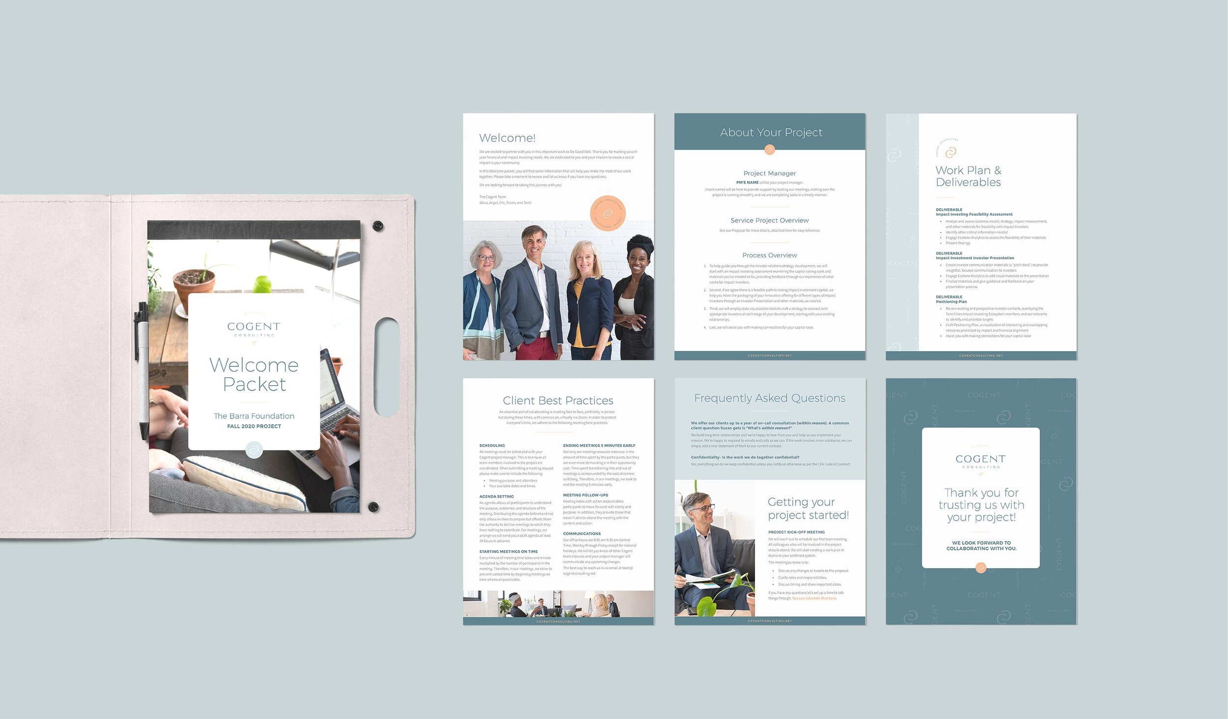
Client welcome guide
Lead magnet PDF
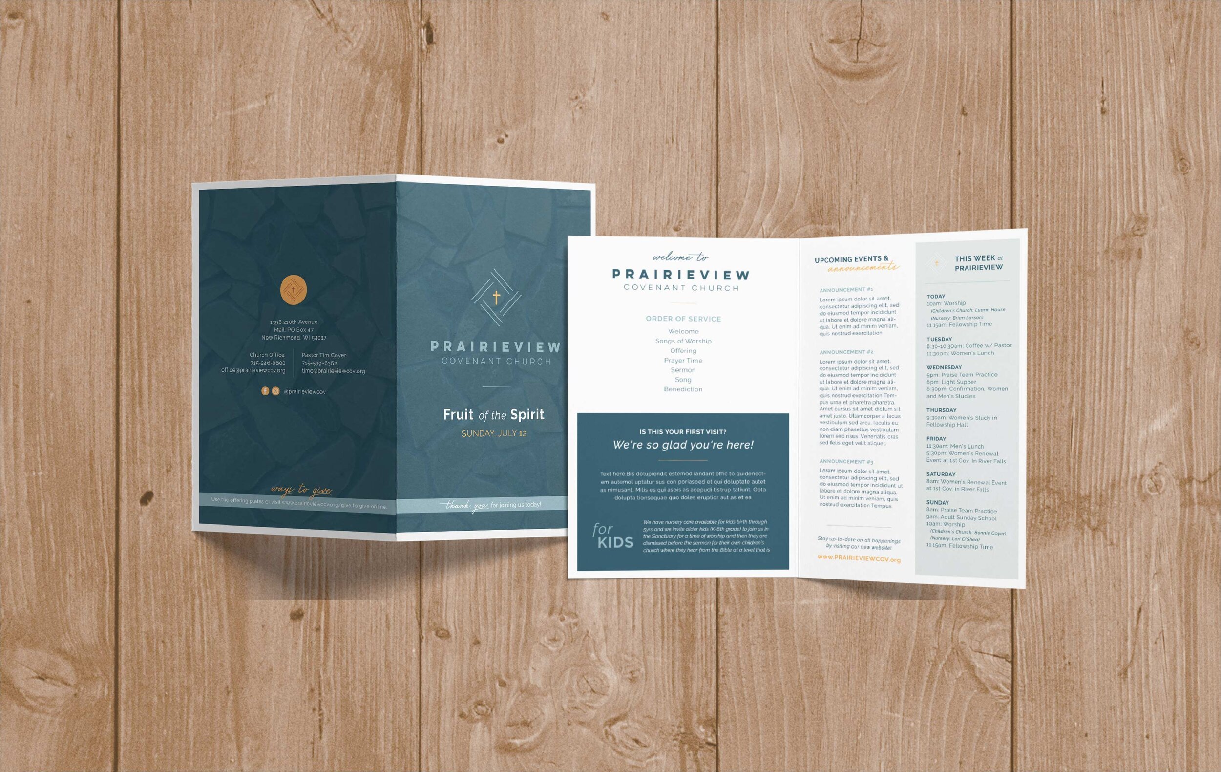
Event flyer or program
Online course materials
Product tags
Lookbook / magazine
Newsletter
Or if you’re feeling overwhelmed, begin with the one that you use the most, so you can start saving time + energy AND look more cohesive in your marketing… like, STAT! Chances are, once you see the kind of impact templates can have, you’ll get the motivation to put more of them in place!
Visual Examples
These custom templates that I designed for branding clients give them the structure to stay consistent and be efficient, AND the flexibility that leave room for varying content.
Employee Business Card Template
Event Takeaway Postcard for Craft Soda Company
Client Welcome Packet for Consulting Firm
Project Proposal Template for Consulting Firm
Home for Sale Instagram Carousel Graphic Templates
Seller Tip of the Week Instagram Graphic Template
For Sale Real Estate Flyer Template
Church Bulletin Design Template
Church Monthly Newsletter Template
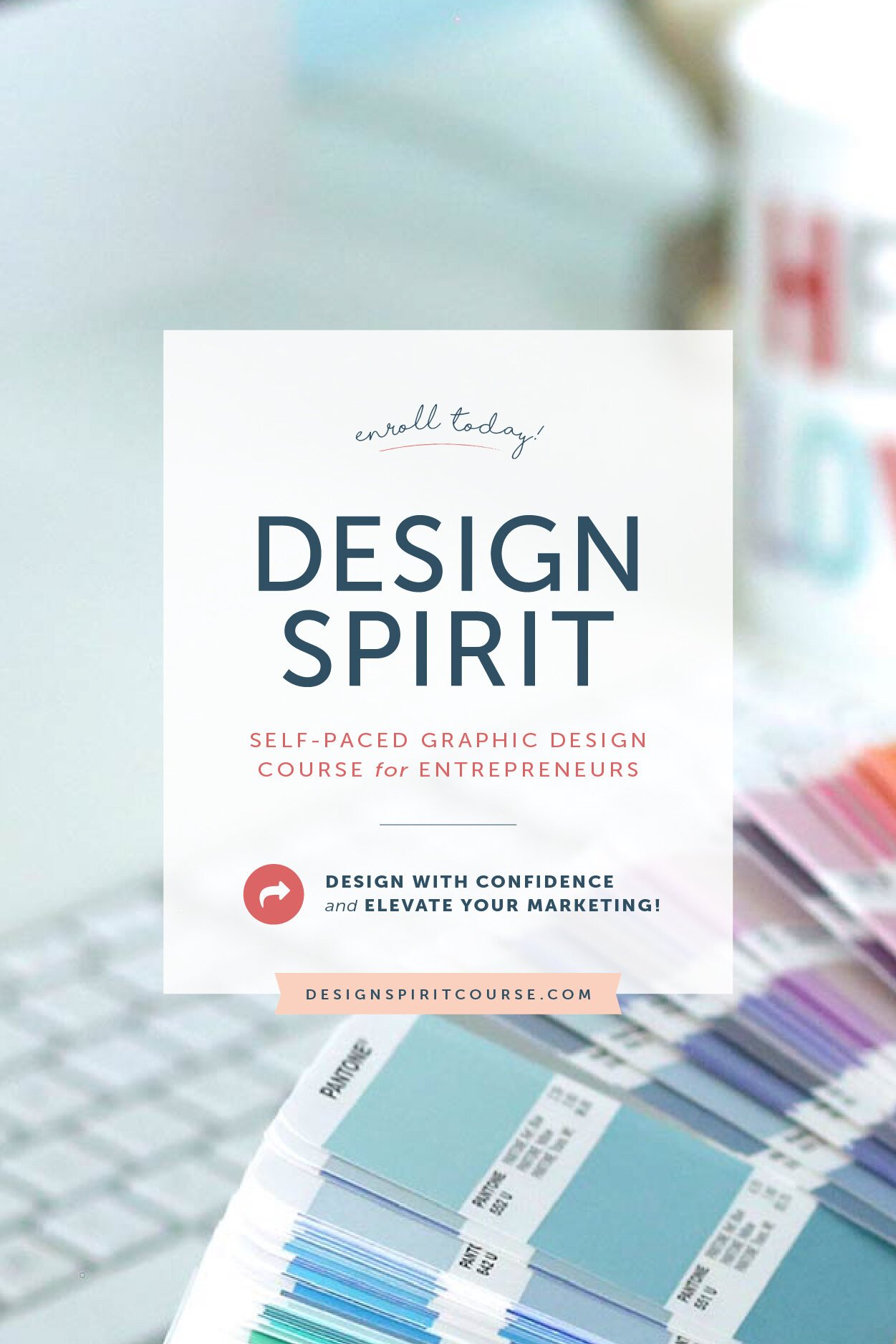
Need more guidance on the design basics, so you can design stunning graphic templates and collateral…all on your own?
The Design Spirit Course is for you!
Design Spirit is a graphic design course especially for small business owners who just want design to feel easier. Inside the course, I’ll give you the tools, knowledge, and confidence to create beautiful, on-brand visuals that communicate your value before you say a word.
Learn the design principles, color theory, font selection, how to create a consistent and cohesive vibe in your marketing, and more in this self-paced program.
YOU MIGHT ALSO LOVE…


