5 Tips to DIY Your Brand Design
The list of benefits that come with investing in a professionally designed visual brand for your business is long, but I’m sure I’m not the first person you’ve heard say that!
However, it’s not always an option or even necessary to outsource your branding and design work… especially when you have the skills and know-how to do it on your own.
Whether you are a new business owner with a small budget or someone who sincerely enjoys all things design and marketing, it IS possible for you to design a beautiful and strategic visual identity for your business.
Perhaps more importantly…
You have the ability to showcase your brand in a beautiful, engaging, and cohesive way across your marketing platforms
which will help you connect with your audience + gain their trust and loyalty.
I’m sharing my best tips for DIYing your visual brand, so you can feel more confident as you dive in. Some of these may surprise you… it’s not all about your logo!
5 Tips to DIY Your Brand Design
THAT’S STRATEGIC AND CONNECTS WITH YOUR AUDIENCE
1. Start with a solid brand foundation.
When you’re feeling motivated to put a new visual identity into motion, it’s easy to jump in headfirst and dive into the design. You open your new design document to start designing your logo or start browsing through the logo templates in Canva, in search of something that catches your eye.
As tempting as it is, my friend, I’m telling you… this is 100% putting the cart before the horse. Gaining clarity around who you are as a business and a brand always should come before design.
I ask all of my clients to complete an extensive Branding Questionnaire before we start designing their brand, which walks them through their brand foundation. This step is absolutely KEY to a successful final product.
Because a truly impactful visual brand is in alignment with your mission, business goals, audience, and place in the market.
Your branding visuals should reflect all of these parts of your business in order for it to feel authentic, resonate with the right people, and have longevity (because who has time to redesign your logo multiple times a year?!).
Whether you’re completely DIYing your brand, purchasing a template or semi-custom brand, or working with a designer on a custom design, I encourage you to go through this process and focus on your brand foundation first.
These questions are taken directly from my client questionnaire…
5 key questions to ask yourself before designing your brand:
What are the mission, purpose, and values behind your business?
What are your current business goals and how do you want your new brand to help you accomplish them?
Who is your ideal client/customer? Dig deeper than basic demographics — think about their stage of life, pastimes, goals, and dreams, favorite brands and places to shop, their struggles (as relating to what you offer them).
What are your differentiators (aka the things you offer that make you different from your competitors)? What makes you unique and amazing to work with?
When someone interacts with your brand, what would you like their lasting impression to be? How do you want them to feel?
PRO TIP: Don’t just think about your answers… actually write them out!
There’s something about taking the time to put it on paper (or in a Google Doc for your techy people) that helps you work through your thoughts and ideas to solidify your brand foundation in a way that sticks. This way, you can also refer back to the document at any time.
2. Define your brand’s style (before you start designing)
Having a defined overall brand vibe and cohesive look + feel across your marketing will help you look professional, gain brand recognition, and build trust with your audience.
Deciding on an aesthetic that aligns with the personality of your business and attracts your audience can feel like a big hurdle, especially when you’re first starting out. Here are some questions that might help get your wheels turning:
What feeling or emotion do you want to evoke to your audience?
What mood do you want your visuals to have?
What style will resonate with your audience?
What do you want your audience’s first impression to be of your business?
Then revisit your brand foundation and, in combination of the notes you jotted down to the questions above, notice any recurring themes in what you wrote. Use this to choose 3-5 specific “Brand Tone” words that collectively describe the unique feel your brand should have.
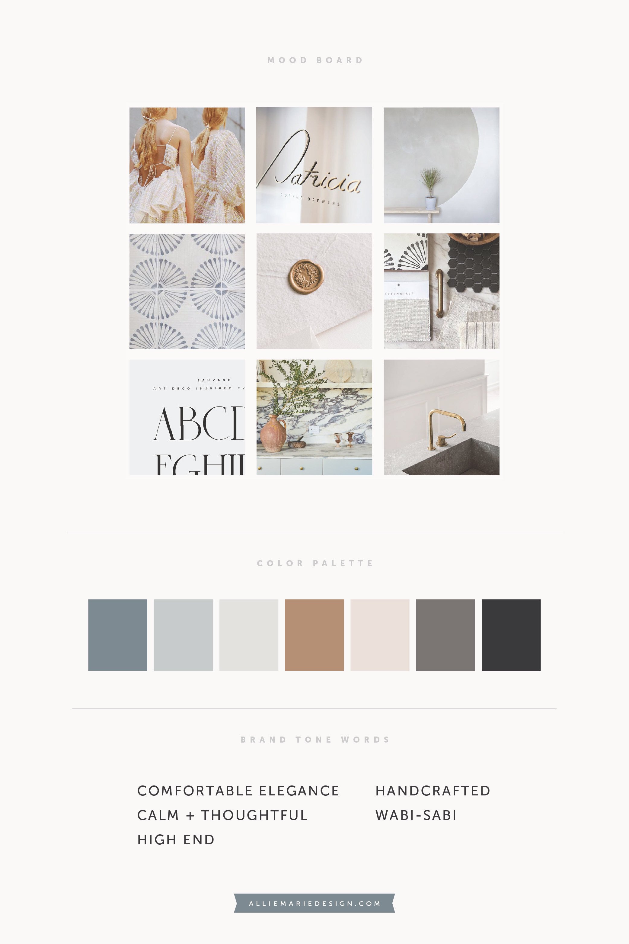
Next, gather visual inspiration — photography, textures, typography, etc. — that has your vibe and aligns with your Brand Tone words (Pinterest is a great tool for this). Then curate a mood board with your favorite images that inspire you, best align with the your brand foundation, and speak directly to your audience. This mood board and your Brand Tone words will be your guide as you not only design your brand, but also into the future when you select photography, design marketing pieces, create a website, plan out your Instagram feed, and beyond.
PRO TIP: Drawing a complete blank and having trouble getting started? Take my Design Spirit Quiz!
I’ll send you personalized results and actionable tips on how design your marketing visuals (and brand!) to align with your style.
Some examples of CURATED mood boards that I created for clients:
You’ll see color palettes included below… this part of your process is a great time to solidify your branding colors, since they play such a big role in communicating your vibe and evoking emotions in your audience.
Do you notice there are some similarities in these two business’ Brand Tone Words? I did that intentionally, so you can see how these words and themes (e.g Calm and Handcrafted in this instance) can manifest themselves in different ways. That’s why it’s important to have the right combination of words and why I encourage you to choose 3-5, so you can get really specific. It’ll also make it easier to pinpoint and create your unique overall brand style!
3. Design your logos and branded marks with simplicity + versatility in mind
It’s easy to over-complicate things when it comes to DIYing your brand.
Instead of creating a detailed logo and complex accompanying design elements, keep it simple and focus on versatility.
Why? Because simplicity always wins. If there are too many elements and symbols and other stuff going on within your brand, it’ll be hard to make consistent and intentional design choices. While a simple and timeless visual brand allows you to easily create a cohesive look in your marketing AND create clear, cohesive, emotional connections with your audience, which will naturally develop trust with them. Timeless > Trendy.
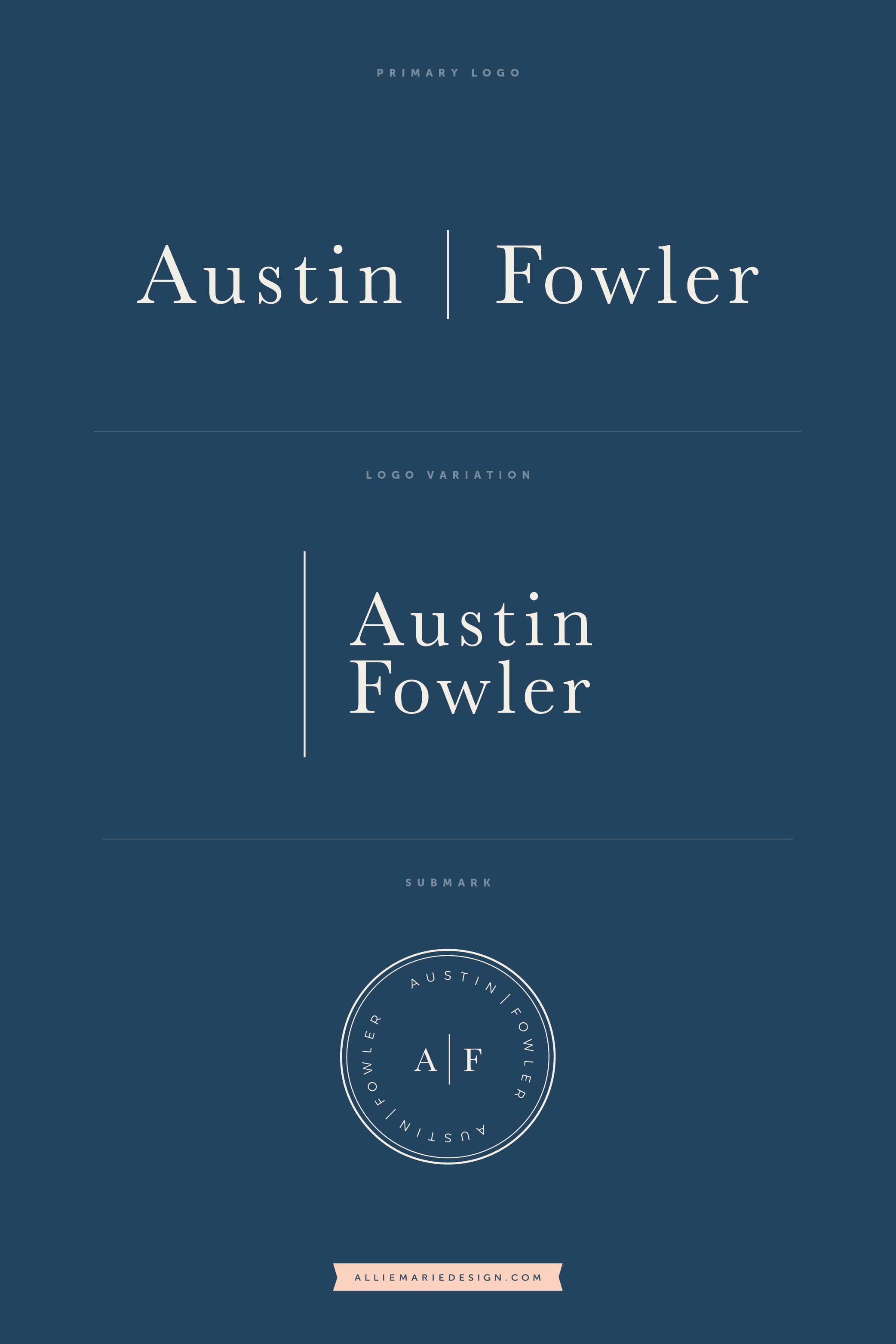
A versatile brand helps give you the flexibility you need to meet the requirements of different marketing/design spaces and contexts, while staying on-brand at the same time. To have this balance, consider creating at least one alternate logo variation that has a different orientation from your primary logo. For example, if your primary logo is horizontally oriented, try creating a vertical variation where the words are stacked — this will be helpful for social media profile images and other uses where you need a more compact design. You may also want to add a third logo or submark to your logo suite that is circular in shape, for extra versatility!
There may be one logo design that you use most often, but having some alternative options and knowing that you’ll still be cohesive and on-brand when you do use them can avoid a lot of frustration down the road!
PRO TIP: Not sure where to begin with your DIY logo?
Start by choosing a font that you love and is easy to read, and type out your name / business name. Play with the letter spacing, uppercase/lowercase, bold and italics, to find a style that you love and matches your vibe. Typographic-based logos can be so elegant and timeless, so this is a great place to start and you can grow from there! To learn more about font choice and pairing fonts, check out my Beginner’s Guide to Typography post.
Alternatively, you could consider Canva’s pre-designed logo templates or purchasing a template from Creative Market.
EXAMPLES OF CLIENT LOGO SUITES that are TYPOGRAPHIC, timeless, AND versatile:
4. Be consistent + cohesive
Being cohesive across all your marketing platforms is SO important. It not only helps you look more professional and like you have your ducks in a row… it also helps you make a memorable first impression and build brand recognition, which leads to trust and your audience investing in you (which, at the end of the day, is the ultimate goal!).
So, my best advice is to choose a visual direction and have your branding elements in place… and then STICK TO IT! Even if you expect to tweak things in the future, don’t stray. If you’re changing your logo, fonts, and colors constantly, you won’t give you audience a chance to resonate with your brand and your visuals a chance to be memorable (because repetition = recognition).
Having a logo in place is just one piece of the puzzle. Check out this in-depth post for more tips and ways you can be visually cohesive across your marketing!
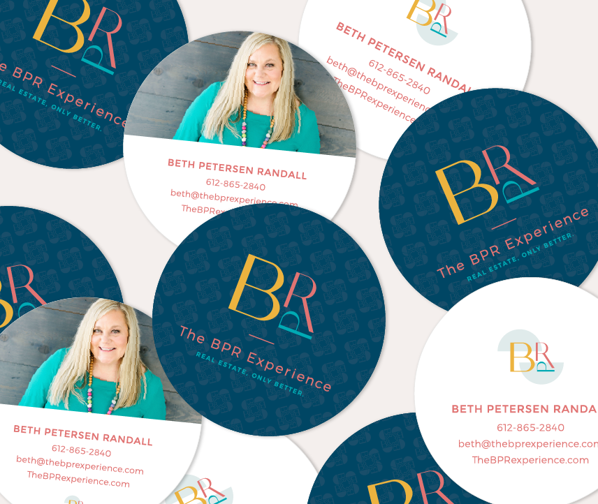
AN EXAMPLE OF A COHESIVE BRAND + CONSISTENT MARKETING:
5. Use your branding elements thoughtfully + strategically…
so you can design Marketing pieces that look professional and make a connection with your audience.
You can have the most beautiful logo and visual identity in the world… but if you don’t thoughtfully use and implement it into your everyday communications and marketing, it won’t have the impact you’re hoping for.
Your visual brand is a tool for communicating your mission and services, and emotionally connecting with your audience. And as they say, the tool is only as strong as its user. By using the design principles and and basic graphic design techniques, you’ll be able to create engaging and refined marketing pieces with your branding elements that reflect the value of your offerings. And make you look like the professional you really are.
Need more guidance on the design basics, so you can create a cohesive look in your marketing and design stunning graphics and collateral…all on your own?
MY DESIGN SPIRIT COURSE is for you!
Design Spirit is a graphic design course especially for small business owners who just want design to feel easier. Inside the course, I’ll give you the tools, knowledge, and confidence to create beautiful, on-brand visuals that communicate your value before you say a word.
Learn the design principles, color theory, font selection, how to create a consistent and cohesive vibe in your marketing, and more in this self-paced program.
YOU MIGHT ALSO LOVE…


