
5 Pro Secrets to Improving Your Design Skills + Creating Better Marketing Graphics for your Business
Over the years of running my design studio, I’ve received lots of questions from my clients and small business friends around how they can bring their visual marketing to the next level.
It’s frustrating to *know* that the quality of your visual graphics is important — that the professionalism and effectiveness of your business marketing relies heavily on the design of your marketing visuals — yet you feel like what you’re creating right now is sub par.
And it’s even more overwhelming when you don’t have the budget to hire a professional, while design needs continue to pop up EVERYWHERE.
I mean, if you really stop and think about all the day-to-day promotional designs like social media graphics, website banners, flyers, postcards, annual reports, pricing sheets, opt-ins, course worksheets, etc... it feels never-ending.
AND WHEN YOU DON’T FEEL CONFIDENT IN YOUR DESIGN SKILLS, THOSE TASKS CAN FEEL EVEN MORE BURDENSOME.
Let’s be honest…it’s so not fun to sit there and tinker with your designs for hours and still feel like something feels “off”.
Then you find yourself going back to the drawing board just to find yourself stuck and not wanting to put your marketing out in the world. Or you put it out there but you feel self-conscious about it and certainly anything but confident.
You find yourself in a complete design fog. And it drives. you. crazy.
How do the professional designers do it? How do they create the perfect layout, choose the perfect fonts and colors, and engage me on first glance?
It feels like they have this magic touch or they know a secret that I’m not in on.
But here’s the truth… it’s not magic. I believe design is a learned skill.
No matter what industry you’re in, you can learn how to expertly create designs that are aesthetically pleasing, meet your goals, and make you proud.
SO DON’T THROW IN THE TOWEL YET, MY FRIEND.
Here are 5 pro secrets to improving your design skills and creating better marketing graphics for your business:

1. Get clear on your goals + plan for your design
Like most other aspects in business, if you head into a design without clarity on your overall goal, the end product won’t be successful. So, every time you sit down to design, know your “why.” What’s your goal for or the purpose of your design? Who is the specific audience for the design? What message are you trying to send?
And on the logistical side of things, where will the design appear? What text needs to be included? What will your main “call to action” be?
Answering these types of questions and planning for your design in advance should always be the first step in the process, before you even start designing.
Why is this important?
When you approach your design with this type of intention, you will set yourself up for success to create more effective and strategy-driven marketing pieces. Which will in turn help you communicate your value to your audience, get your message across to them and, ultimately, help your business grow in the way you want it to.
2. Understand and follow the Principles of Design + Composition
This is KEY to creating well-balanced and professional quality designs!
As business owners and humans in general, we have personal values and principles that we live by. A set of guidelines or a “code of ethics” that help us make decisions. Well, when it comes to design, there are also a set of principles you can learn, practice and eventually embody every time you work on a design project. They will help you make better design decisions and ensure the designs you create are pleasing to the eye and EFFECTIVE.
Using these principles will help you avoid your design pieces looking disconnected or like you made arbitrary decisions, which can devalue and discredit what you’re trying to communicate (not ideal).
There are many different bona fide design methods and principles out there. Here is a quick overview of what I consider to be the most important and relevant principles:
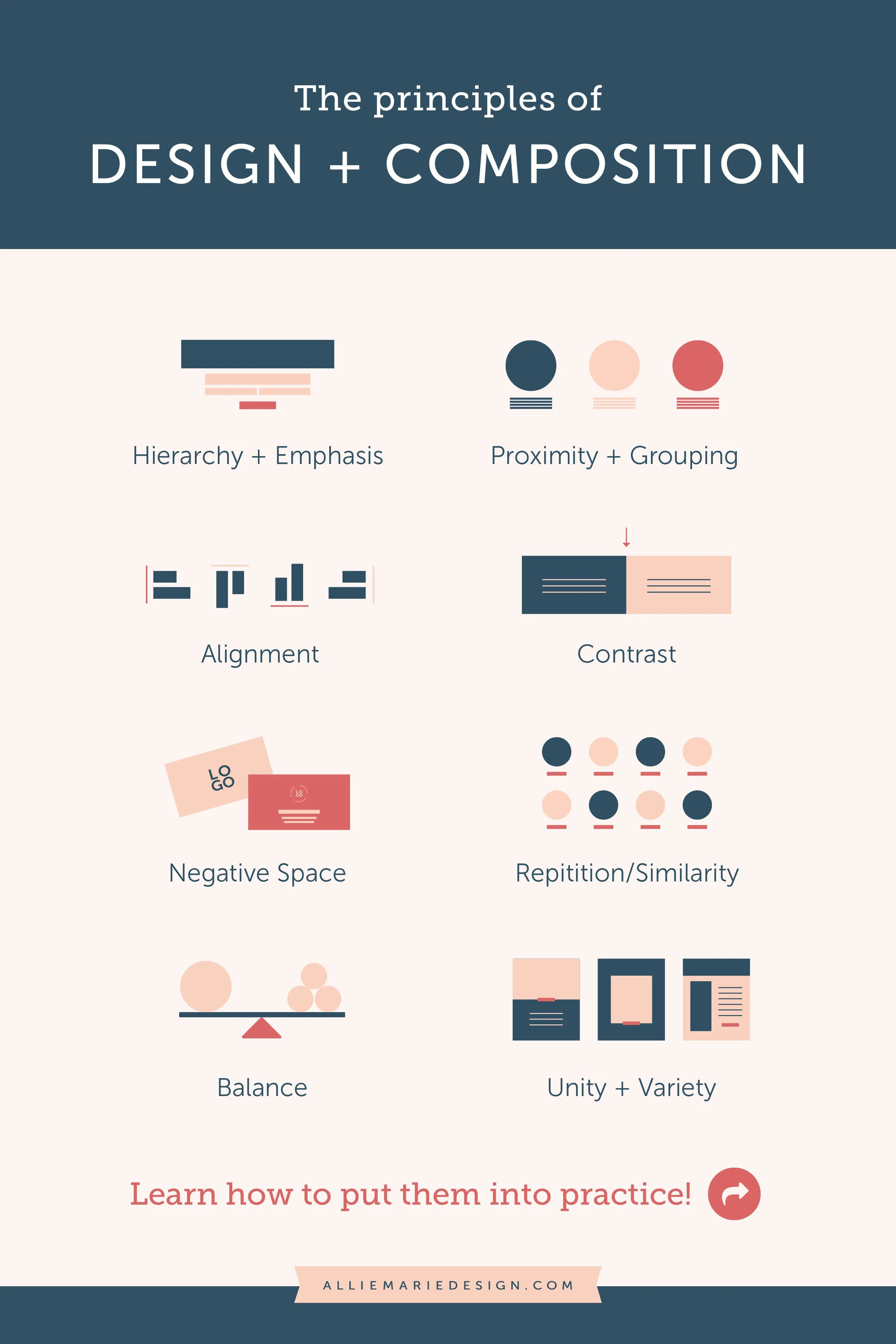
Hierarchy + Emphasis
Visually ranking different elements in a design, guiding the viewer through the design and portraying information in a way that shows an order of importance. Having good hierarchy in your design helps visually tell the viewer where to look first and then influences the order in which they take in the information that’s in front of them (having one “point of emphasis” or focus point helps with this).
Proximity + Grouping
Grouping related elements together to help give your design order and keep things organized. Creating relationships between elements and organizing information in a design in a thoughtful way helps the viewer digest the information in an orderly way.
Alignment
The placement of text or other visual elements so they line up in a composition. Having good alignment helps your design look more orderly, organized, balanced, and intentional.
Contrast
Simply put, creating a visual distinction between two elements (or sets of elements). Contrast is attractive to the eye, helps organize information, helps with legibility, and creates nice interest within a design so not all your elements look the same. It also helps you grab your viewer’s attention and creates focus so you can clearly communicate your message. You can create contrast in so many ways… using color, size, typography/font choice, or utilizing unique design elements like patterns, textures, shapes, etc.
Negative Space
The “empty space” in a design that does not contain content, or the space between, around, above, or below design elements (it’s also referred to as “white space,” but it doesn’t have to be white, necessarily!). Using negative space effectively will give the elements in your design room to breathe and will help keep the focus on your “point of emphasis” or message.
Repetition/Similarity
Using elements that have similar characteristics to create consistency within a design. What will result is a cohesive aesthetic that will, if you’re strategic about your choices, ensure you’re on-brand too. When there is a lack of similarity between elements, the result is a design that feels disjointed and chaotic… your message won’t be as clear as you’d like it to be!
Balance
Placing elements in a way that distributes the visual weight equally in the design and ensures the viewer’s eye easily moves from one element to the next. When you step back from your design, there should be a feeling of wholeness. While an unbalanced design won’t feel right -- when you look at it, it may give you a sense of tension or an unsettled feeling. It won’t feel unified.
Why is this important?
Every design you create communicates something. Using these design principles will help you do this in a compelling and strategic way… which will in turn help elevate your marketing, which will help your business grow.
Fun Resource!
The Principles of Design + Composition are truly the foundations of design. If you’re interested in truly understanding each of them, how to use them, and how to change the way you approach your designs, check out my Design Spirit course!
3. Ensure you’re being consistent + cohesive across your visuals
When you set out to create consistent and cohesive visuals for your business, what you should be after is an intentional and uniform vibe throughout all marketing platforms and client/customer touch-points. From your website to your social media, from your business card to your email marketing, you should be giving your audience visual cues that they’re receiving something from you, before they even read your business name.
How do you do this? Break down the different visual branding and design elements and ensure you’re using them consistently. Uniformity in your marketing design can be achieved in many ways, including:
Sticking with a set color palette
Using carefully selected (and limited) fonts
Incorporating photography and imagery with a similar aesthetic
Having an established set of memorable logos and symbols (and using them in a consistent way)
Utilizing recognizable and consistent layouts for graphics and imagery
A great way to ensure you’re being consistent? Set up a brand style guide for yourself (if you don’t have one already!) with all your logos, colors, fonts, and other design elements in one place. Then follow it every time you sit down to design! Hint: I help you compile your branding elements into a brand style guide in my Design Spirit course!
Why is this important?
Cohesive visual marketing will help you build brand recognition and evoke a sense of confidence, professionalism and credibility in the eyes of your audience. If you’re changing your colors, logo, etc., every few months, you aren’t giving yourself a chance to be memorable and your audience a chance to truly start to recognize you.

Free Resource!
Feeling a little lost when it comes to your overall vibe and creating a cohesive aesthetic for your marketing?
Take my free quiz to discover your design personality and receive personalized and actionable tips on how to enhance it in your marketing!
4. Keep it simple.
I’m a believer in the idea that simplicity always wins. The biggest mistake I see people make is over-complicating their marketing designs — squishing too much text into one design, having too many calls to action, or incorporating too many design elements that don’t relate to one another (clashing colors, more than 3 fonts, or photography that doesn’t match the vibe of the brand and business).
When this happens, the message in the design becomes unclear and your audience doesn’t know what to take away from what they’re looking at. While, when there’s a sense of simplicity in your design, it allows you to create clear, consistent, emotional connections with your audience… which will naturally catch their eye and develop trust with them (the ultimate goal!).
Just a few ways to ensure you’re keeping things simple (there are so many!):
Have one “point of emphasis” (see Hierarchy + Emphasis in #2 above!). Whether it’s a text headline or a visual element, use size, color, etc. to ensure your audience sees it first.
Keep the amount of text to a minimum and only include the details your audience NEEDS to know. Too much text = clutter = nobody wants to read it.
Include one clear “call to action.” Make sure your audience knows exactly what you want them to do after seeing your design. Giving your audience too many directions will confuse them!
Why is this important?
Keeping things simple and clean with your design allows you to keep the focus on your message, which is the important part of the design. If your message isn’t clear, then what’s the point in doing it in the first place? So, make it easy on YOU to design and easy on your AUDIENCE to interpret what you’re trying to communicate. Go simple!

5. Get (and stay) organized!
We’ve all heard the phrase, “Cluttered house, cluttered mind.” Same goes for how you’re organizing your design files!
When you sit down to design, the last thing you want to do is waste time digging through your files trying to find that one logo file in that one color. Or that one graphic you created that you want to use as a template for the new one you’re designing.
The solution? Create a file organization system.
Use different folders for each logo, watermark, and other branding elements. Label the files appropriately so you know what it is, what color it’s in, if it’s for print use (high resolution) or web use (low resolution). Have a special folder for all the photography you use on a regular basis. Have your color codes stored in one place, so you can easily grab them when you need ‘em. Ensure your fonts are downloaded on your computer and easily accessible in the design program you use.
Why is this important?
This sounds like a simple thing, but keeping your files really organized and clean helps you find what I need faster when you’re designing. It helps with efficiency and avoiding you getting creatively drained or frustrated… let's conserve our energy for and keep the focus on creating amazing graphics for your business!

Wish you could have a graphic design crash course that covered the ins and outs of all this (without burning a hole in your pocket)?
You’re in luck.
I created my self-paced online graphic design course, Design Spirit to help rescue you from the annoying design fog you may often find yourself in and connect you with the right tools, knowledge, and exercises to design like a professional.
We’ll get into the nitty gritty of planning for your design, all the Principles of Design and Composition, how to be cohesive and consistent in your marketing, creating a solid design process for yourself (with an inside look at mine + a cheatsheet!), and permission to steal my file organization system, so you can be more efficient.
Design Spirit will demystify these supposed “secrets” of design and help you start creating visually consistent and beautiful designs that make you proud.
YOU MIGHT ALSO LOVE…


