

Zion Covenant Church
INDUSTRY: Church, Non-Profit
SERVICES: Logo + Visual Identity, Print Materials, Social Media Imagery
ABOUT THE CLIENT
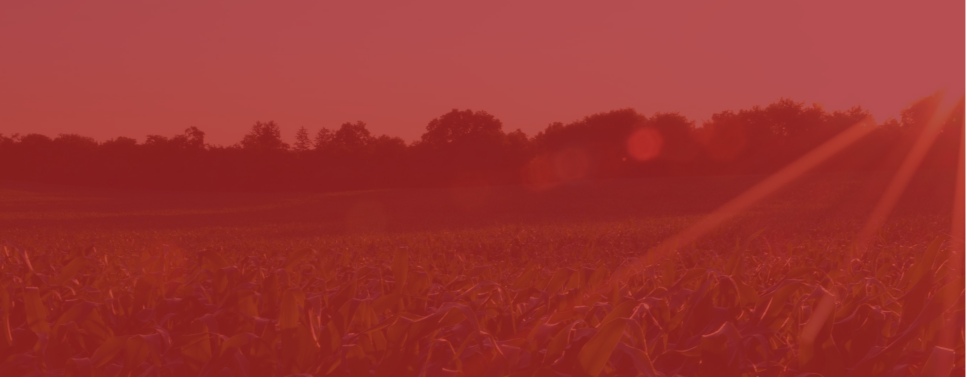
Located in rural Wisconsin, Zion Covenant Church was ready for a rebrand after refreshing their messaging and process — how they communicate their beliefs, how they connect and invite people into their community, and how they help guide members in their spirituality. Their Strategic Team developed a meaningful tagline that spoke to their beliefs and process, as well as connected to their community: Plant, Grow, Harvest. This tagline and their mission was in the front of our minds during our branding process!
The church is rooted in history but the organization is also alive, growing, and focused on the future. We set out to find this balance visually and developed a bright, modern, and joyful visual brand to help attract new and younger families in their area… all while remaining minimal and elegant to help keep their current members in mind and remain welcoming and inviting to all.
The colors and styling are fresh, clean, bright, and authentically connect to their mission and their community through the agricultural theme and the icons that directly connect to Plant, Grow, Harvest. The simple mono-stroke letters in the logo are simple, modern, and open, creating calming and peaceful feel and contributing to the welcoming feeling we were going for. We further emphasized Zion Covenant’s tagline and mission with the accompanying patterns and the rough blue texture adds a subtle earthy vibe. The ministry marks have a more casual feel that's perfect for kids while using color and shape to remaining consistent with the rest of the brand. Learn more about the story behind this brand in my Brand Reveal blog post.


