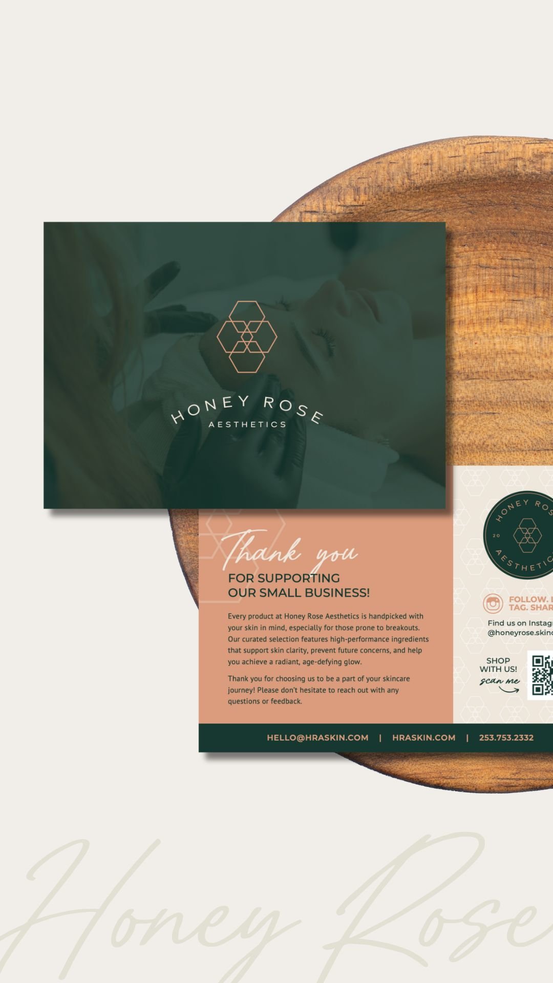
Honey Rose Aesthetics
INDUSTRY: Skincare
SERVICES: Branding, Social Media Graphics, Brochure and Flyer Design
BRAND TONE: Chic, timeless, natural, warm, balanced, comfortable
ABOUT THE CLIENT
Honey Rose Aesthetics is a boutique skin care clinic that uses advanced services and products to help clients re-harmonize, balance, and clear their skin naturally, so they can age gracefully with healthy, glowing skin from the inside out. By getting to the root of their unique skin needs and being a compassionate partner on their skin care journey, we empower clients to step into their confidence and be the best version of themselves.
After seven years in business, HRA has evolved and they were ready for a timeless, sophisticated, and refined visual brand that better aligns with their expertise, advanced services, and high-touch client experience. The new brand will set a solid foundation for HRA as they work toward these goals, bringing more cohesion to their marketing—from digital to print to decor—and helping them confidently continue to grow the business in exciting ways.
Photos courtesy of Honey Rose Aesthetics
INSPO BEHIND THE DESIGN
We set out to create a brand with a unique blend of calm and authentic yet chic. The modern, minimalist lettering paired with the personal handwritten script and the boho-inspired colors help convey this and give a nice balance of structure and warmth.
MORE INSPO BEHIND THE DESIGN
The brand mark / symbol uses hexagons and their arrangement to connect the visual identity to the Honey Rose name (hexagons speaking to “honey” and the flower shape speaking to “rose”). The overlapping hexagons and their angular shape also give a nod to the clinical side of HRA, conveying quality, trust, and expertise, and contrasting beautifully with the softer lettering.
KIND WORDS FROM THE CLIENT


