Blossom Spa Retreat
INDUSTRY: Spa + Wellness
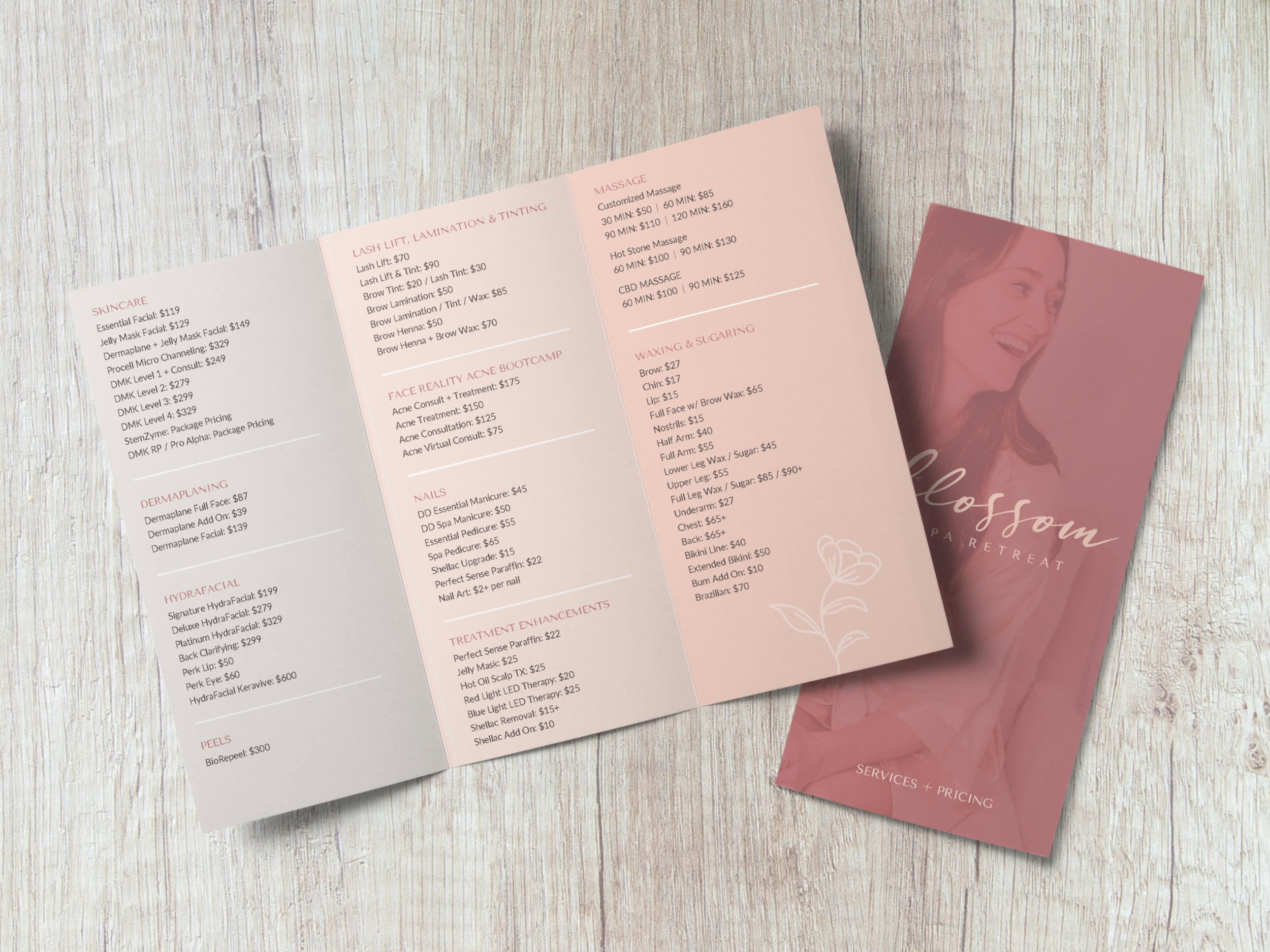
SERVICES: Branding, Social Media Graphics, Brochure and Flyer Design
BRAND TONE: Feminine, Natural, Casually Sophisticated, Approachable, Light + Airy
ABOUT THE CLIENT
Blossom Spa Retreat helps women reignite their self-confidence through personalized skincare treatments tailored to individual needs. Their estheticians take pride in educating clients on the skin journey and crafting custom at-home regimens that ensure long-lasting results. With a focus on building meaningful, long-term relationships, Blossom fosters an environment of care and relaxation, helping clients feel rejuvenated and empowered. The spa’s holistic approach blends results-driven treatments with a serene atmosphere where clients feel comfortable and at home.
After over three years in business, Blossom was ready for a more streamlined and cohesive brand message to reflect their continued growth and commitment to excellence. Our goal was to give Blossom an elevated visual identity that matches the quality of service and expertise they provide. The result is a look that feels sophisticated while maintaining the personal, "at home" charm that Blossom is known for.
Photos courtesy of Blossom Spa Retreat
INSPO BEHIND THE DESIGN
We set out to create a brand that felt effortlessly classic, feminine, and “at home” to connect with Blossom’s ideal client and align with the atmosphere at the spa (which is located inside a renovated historic home in the PNW).
The color palette, typography, and textures are a lovely blend of sophisticated and inviting, with the warmer neutrals and green adding a natural touch. The custom illustrated flower is a standout—feminine, classic, friendly, and speaking to growth and natural beauty.
KIND WORDS FROM THE CLIENT


