Attavita
INDUSTRY: Consulting
SERVICES: Branding, Stationery, Postcard
BRAND TONE: Boutique, Trustworthy, Comfortable, Positivity, Guidance, Scandinavian-inspired
ABOUT THE CLIENT
Attavita, meaning “compass” in Icelandic, is a law consulting firm in the Twin Cities. The founder, Gina, was inspired to form her company while hiking in Iceland. There are a lot of directions you can go in the legal world, and Gina helps lawyers navigate the terrain by giving them the tools and strategies they need to excel in their career.
Gina’s travel experience to Iceland was transformative for the vision of her business, so she knew she wanted to incorporate that experience visually to feel connected to her brand.
INSPO BEHIND THE DESIGN
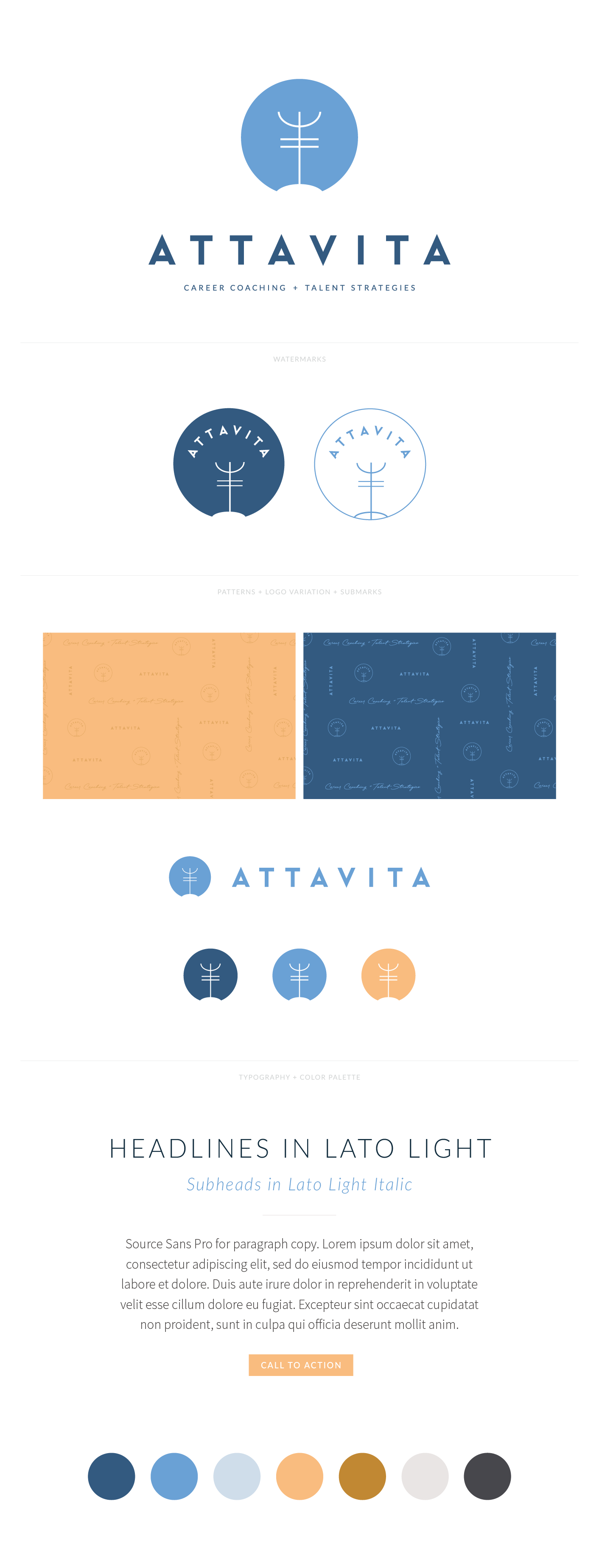
This subliminally Scandinavian-inspired look feels modern, boutique, and professional, while creating a sense of comfort and warmth that ties back to Gina’s personalized approach through a combo of cool and warm colors, clean typography, and nordic imagery.
The logo symbol is a play on an Icelandic symbol that represents the word "guide" or "compass," tying directly to the Attavita name and how they serve their clients, while also nodding to the origin story of the brand.
KIND WORDS FROM THE CLIENT


